Follow the steps below to learn how to customize the template theme to highlight your brand, and add images, slideshows, and custom text through widgets to make your bids more attractive.
Accessing the Template Design
1 Create a template. Begin by clicking Admin in the top-right. From the left-hand navigation, click Templates, then Proposal Templates.
| NOTE: Don't see this option? Ask your account administrator to assign you a user role that gives you full access to smart custom proposals. |
Click Create template in the top-right. Give it a name, then enter a short description if necessary. Click Save.
Click Design in the top-right.
Or access an existing one. Begin by clicking Admin in the top-right. From the left-hand navigation, click Templates, then Proposal Templates.
Click Design next to an existing template.
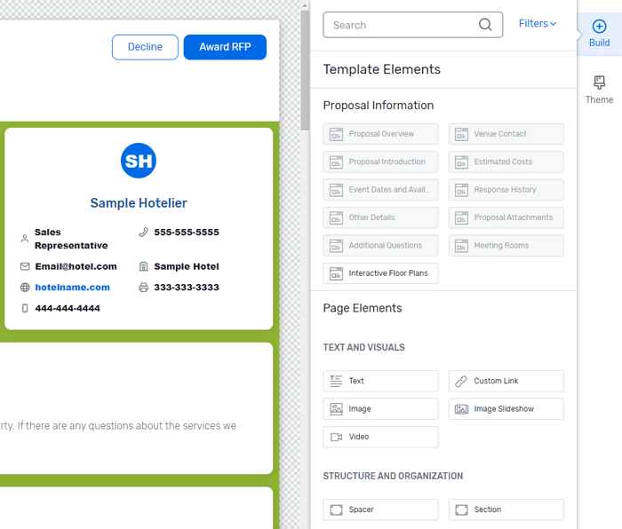
2 Review the default template. The custom proposal template consists of several elements, also known as widgets, that are added to a canvas where you can see all your edits reflected in real time. The widgets include:
- Sections - divide your canvas into chunks. You can use them to group widgets together, such as the overview and venue contact.
- Spacers - are used to create buffers or additional spaces in between your widgets.
- Text and visuals - allow you to add content to your sections, such as text, images, videos, slideshows, or custom links.
The widgets related to essential proposal information (e.g. Proposal Overview, Estimated Costs, or Event Dates and Availability) are already added to the canvas and cannot be removed, but they can be customized.
Scroll down the page and review each section to get an idea of how the proposal information is organized in the template. As you hover over the canvas, each existing widget is highlighted in a blue border, while sections display an orange header and border.
To the right of the canvas, under Page Elements, you can see the additional widgets you can use. These are all part of the Build menu in the top right.
Now that you know what is included in the default template, you can start customizing it to make it unique.
Customizing the Template Theme
Rather than individually editing each widget to create a cohesive page, customize the Theme section to apply your changes across the entire template.
1 Access the template theme. Click Theme in the top-right.
2 Edit the theme fonts if necessary. Under Theme Styling, click Fonts. Use the Primary and Secondary dropdowns to select the desired font families.
When you're done, click the  icon next to Fonts to return to the Theme menu.
3 Edit the theme colors if necessary. Under Theme Styling, click Colors. There are six theme colors you can edit. Each one applies to a specific template element. For example, to modify the background color of all widgets in the template, enter the desired hex code in the Color 2 field or use the color palette next to it.
When you're done, click the icon next to Colors to return to the Theme menu.
4 Edit the site dimensions and background if necessary. Under Theme Styling, click Dimensions. By default, the template layout width is set to fit the entire screen and its content is set to fit the full width. To customize the dimensions, uncheck the option you need, then set the desired maximum width.
Click Site Background. You can change the color of the background by entering the desired hex code or you can add a background image.
When you're done, click the icon next to Site Background to return to the Theme menu.
5 Customize your template text. Under Text Styling you can personalize the font family, weight, size, or color of various text components such as headers, paragraphs, or links.
6 Save or reset changes. To keep your changes, click Save in the top right.
If you're not happy with the changes you've made, click Reset Theme Styles to start afresh.
Managing the Template Widgets
1 Customize existing widgets if necessary. Select the widget you want from the canvas by clicking anywhere inside it. Click Customize to the right of the canvas to display a list of all the styling options available within the selected widget.
Click the option you want, then customize it per your needs. The changes you make will display on the canvas in real time.
To return to the list of styling options available in the selected widget, click the  icon to the right of the canvas, next to the option name.
To return to the main Build menu and deselect the widget you have customized, click the icon to the right of the canvas, next to the widget name.
To keep your changes, click Save in the top right.
| NOTE: Updates to a widget will override changes made to the Theme. |
2 Add widgets if necessary. You can add widgets to an existing section or you can create additional sections.
To add a widget to an existing section, select the one you want from the Build menu and drag it to the desired position on the canvas.
To the right of the canvas, you can configure and customize various styling options, depending on what type of widget you added.
To create an additional section, select and drag the Section widget to the desired position on the canvas. To the right of the canvas, you can customize the section by adding a background image, tweaking the border and spacing, or splitting it into several columns.
Click inside the section and select the widget you want to add. To the right of the canvas, you can configure and customize various styling options, depending on what type of widget you added.
You can add as many widgets as you want to a section.
3 Duplicate or remove a widget. If you added extra widgets to your template, you can copy or remove them by hovering over the widget's top-left corner and clicking Duplicate or Delete respectively.
4 Save and preview your changes. To keep the changes you make to the template, click Save in the top right. If necessary, click Preview to see what your proposal would look like to planners when using the template. You can preview the template in desktop, tablet, or mobile mode.
When you're done, click the icon in the top right to return to the design mode.
